
City Beauty - Full Brand Packaging Redesign
My role: Lead designer and co-author of the internal pitch — research, color system development, product line architecture, UC/SC mockups, and cost analysis, presented to management for approval.
Brand Research
Color Strategy
Competitive Analysis
40+ SKUs
System Design
City Beauty had built its identity on a uniform navy palette — functional, consistent, but increasingly misaligned with where the brand was headed as it expanded into retail at Macy's and Walgreens. The redesign project began as an internal initiative to understand whether a packaging evolution could strengthen the brand's position, and if so, what that evolution should look like. Before a single new design was made, the team conducted market research, competitive analysis across six comparable brands, and a color psychology review to build the strategic case for change.
MARKET RESEARCH — THE CASE FOR CHANGE
→ Women in their 30s buy more anti-aging products than women aged 40–60 — the brand needed to appeal to a younger customer entering the category
→ Research from Jiangnan University found middle-aged women prefer softer, more neutral color palettes — validating a shift away from uniform navy
→ Monochromatic packaging is perceived as more modern, aesthetically pleasing, and professional — and drives higher purchase intent in skincare
→ By 2028, women are projected to control 75% of discretionary spending in the US — brand positioning ahead of this shift matters
→ Packaging design can be the sole reason for a product's purchase, particularly when it stands out against competitors at shelf

COLOR PSYCHOLOGY - THE PROPOSED PALETTE
→ Soft blues (Periwinkle, Harbor) — associated with peace and tranquility; communicates a spa-like daytime experience
→ Deep navy (Midnight Blue) — associated with maturity and stability; retained for the night line as a signal of depth and efficacy
→ Vanilla and warm neutrals — associated with warmth and joy; a complementary contrast to the cool blues across the makeup line
→ Yellow-orange and blue-purple are complementary colors on the color wheel — the vanilla/navy pairing is aesthetically grounded in color theory
COMPETITIVE ANALYSIS — BRANDS IN THE SAME PRICE RANGE
Six brands (Fresh, Estée Lauder, Tatcha, Caudelie, Clinique, and Strivectin) were analyzed for packaging approach, color strategy, and perceived positioning. The research identified a clear gap: City Beauty's monolithic navy was outlying in a category trending toward differentiated, line-coded systems.
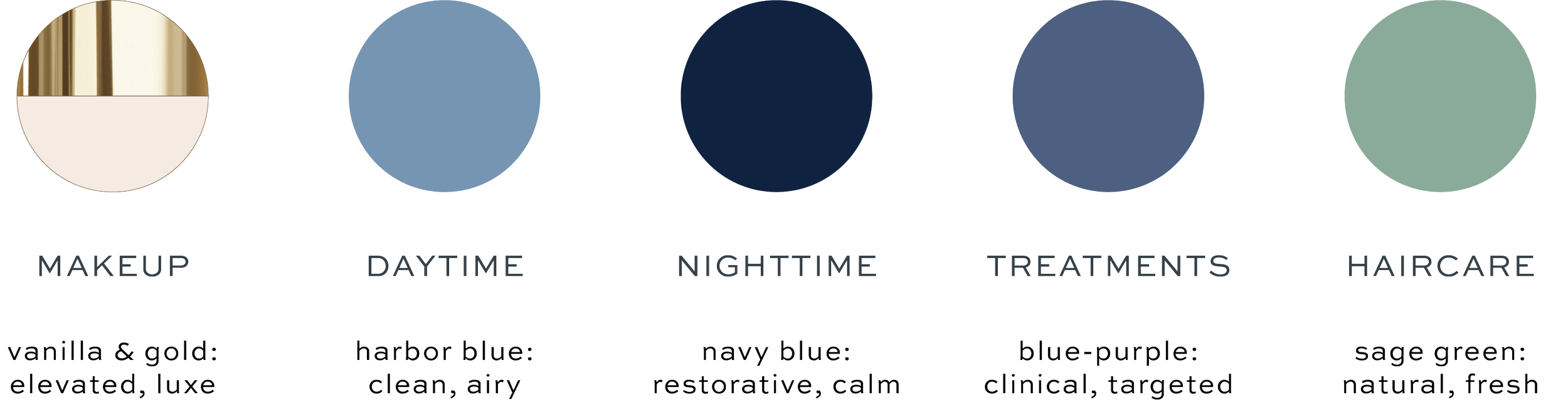
The Five Product Lines:
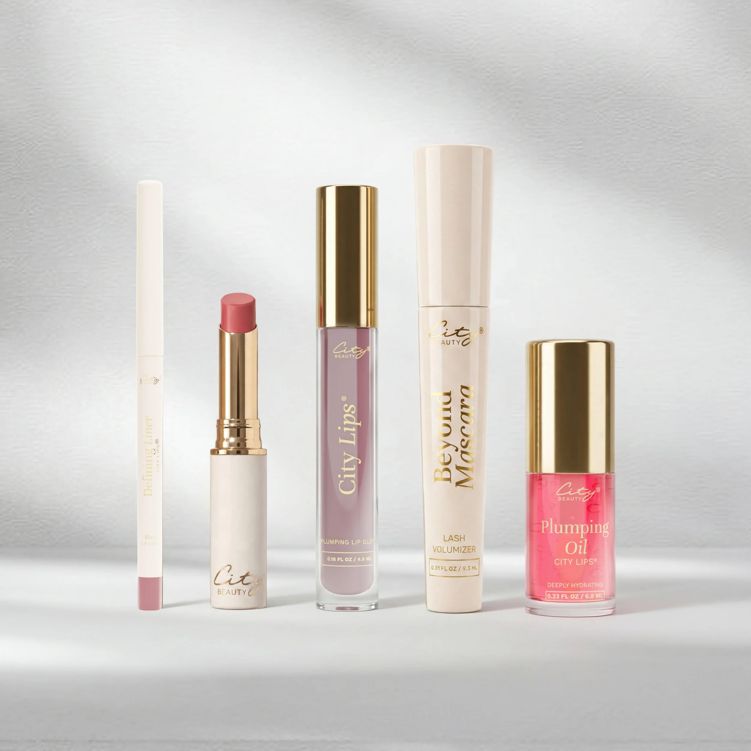

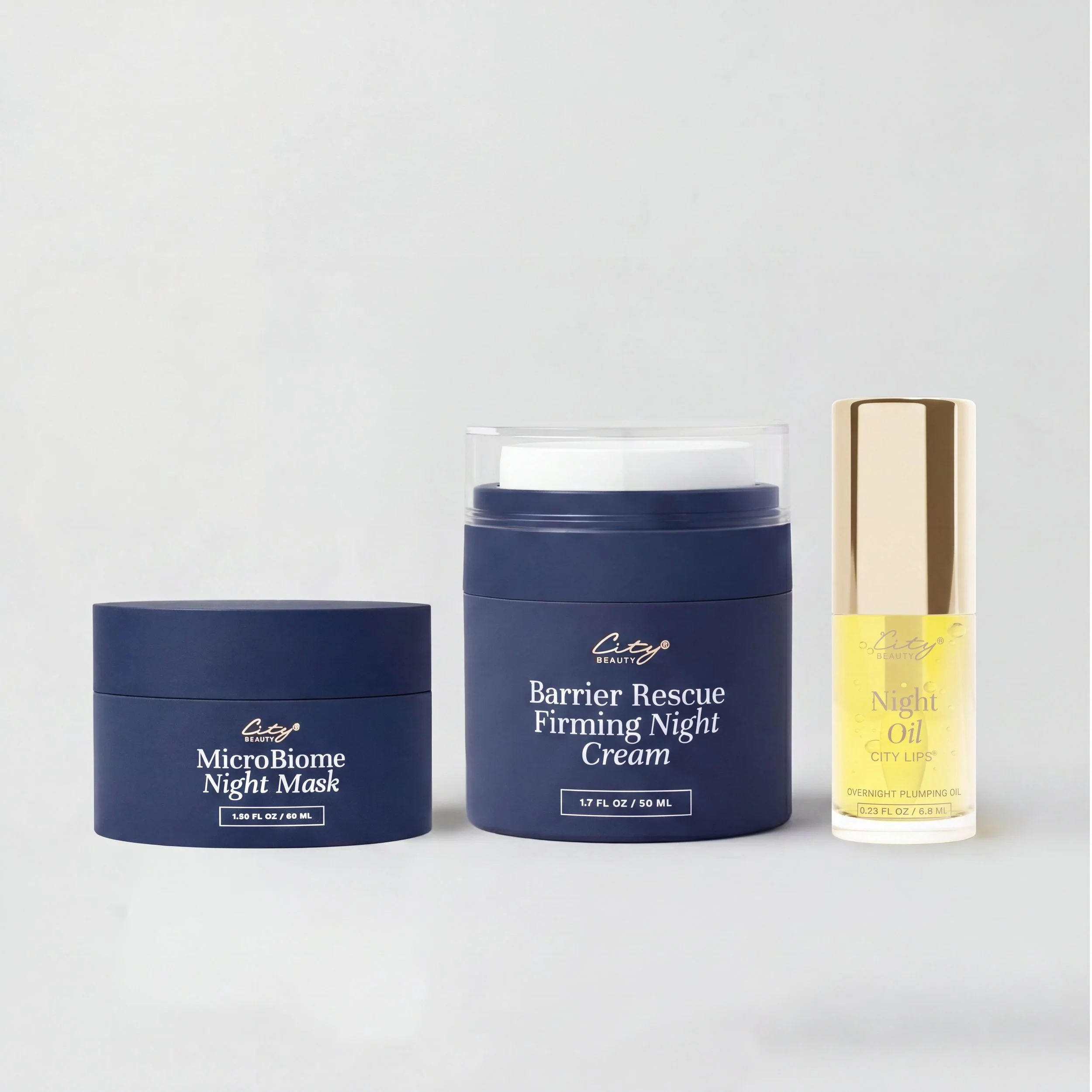
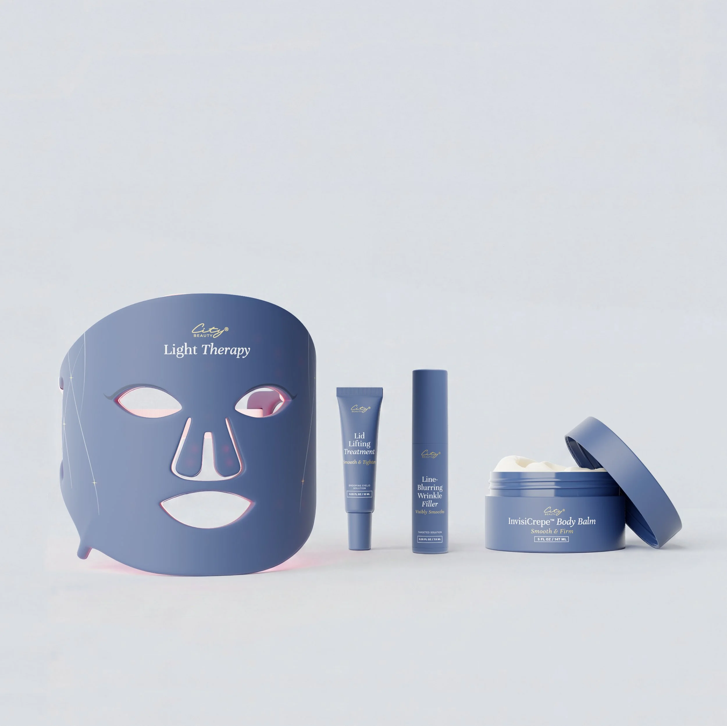
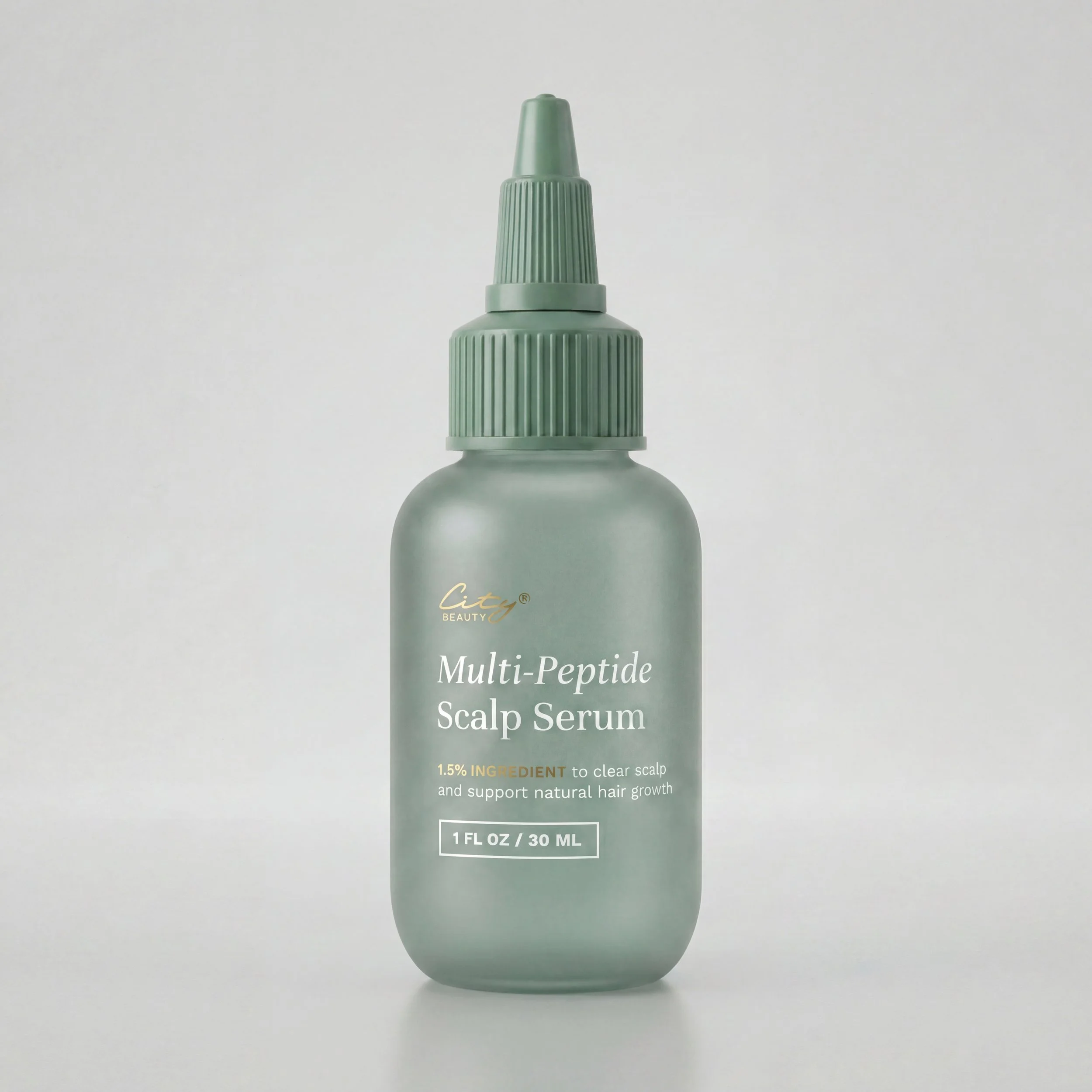
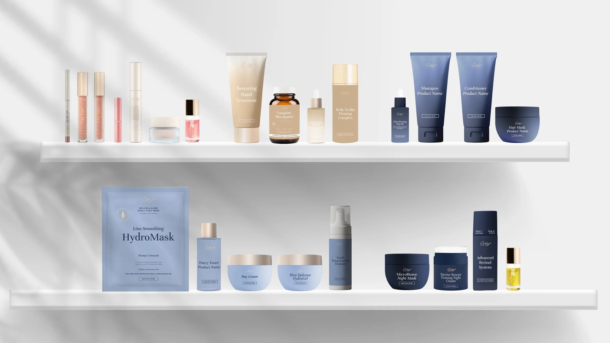
Key design decision — Gold caps vs. monochromatic finish
CONSIDERED
Gold caps — retained premium signal
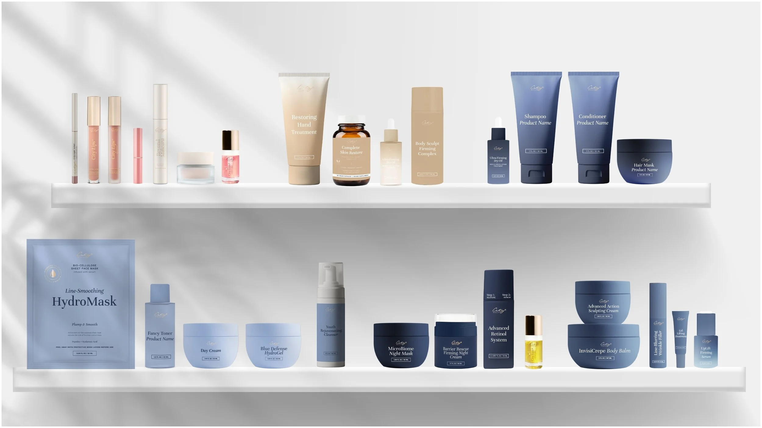
Gold caps maintain a luxury cue familiar to existing customers and align with the brand's heritage aesthetic. However, they create visual inconsistency across the line-coded system — the gold reads as generic premium rather than category-specific.
RECOMMENDED
Monochromatic — full system cohesion
A fully monochromatic approach — caps, bodies, and cartons all in the line color — creates a stronger shelf presence and clearer category communication. Research supported higher purchase intent for monochromatic packaging in skincare. Management endorsed a full redesign ahead of retail entry.
OUTCOME
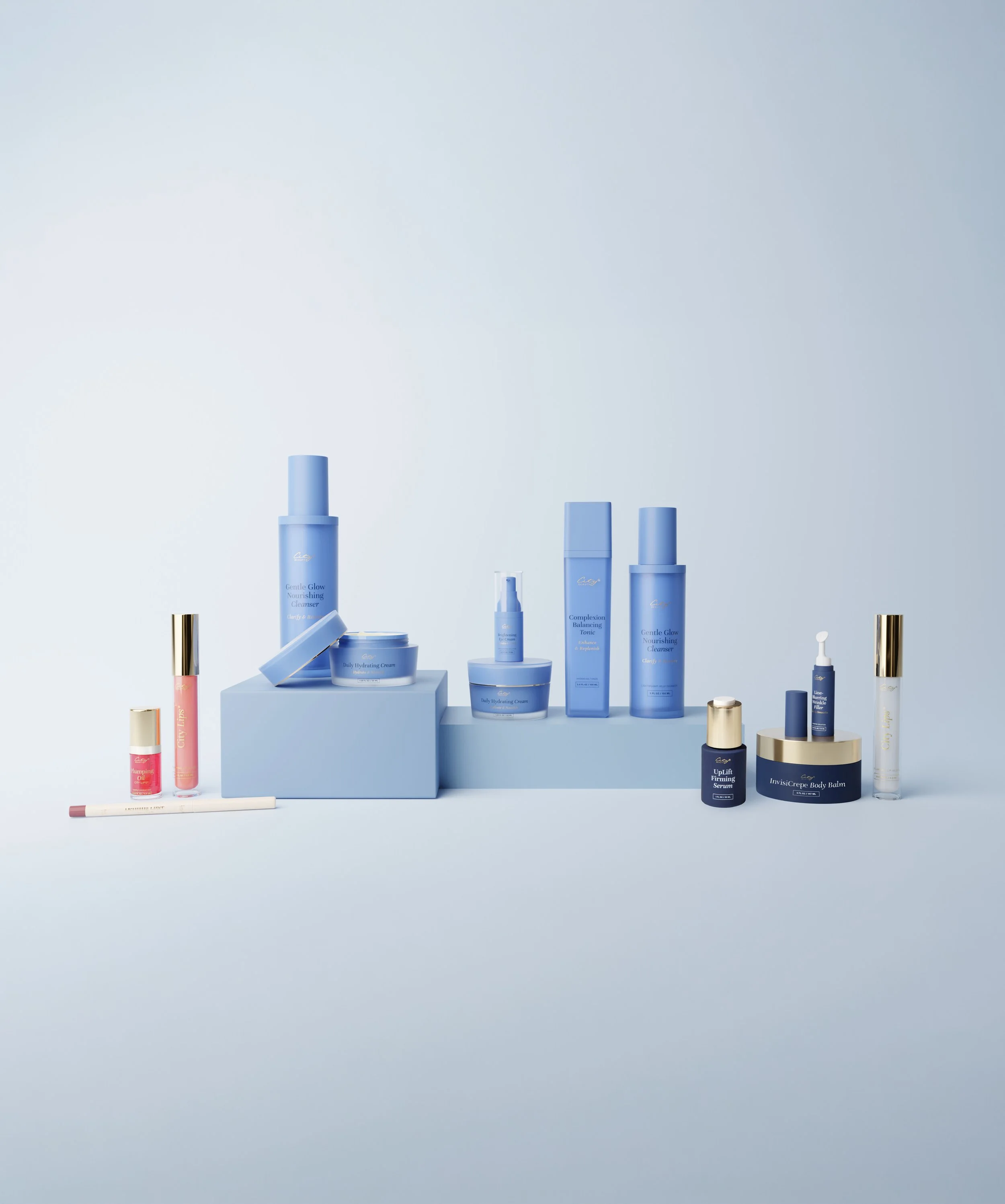
The pitch was approved, initiating a full packaging redesign across 100+ SKUs. The five-line color system was adopted as the organizing framework — Makeup (Vanilla/Gold), Night (Midnight Blue), Daytime (Spa Blue), Treatments (Blue-Purple), and Serums (Transparent Gradient). The redesign was executed ahead of City Beauty's entry into Macy's and Walgreens, ensuring a cohesive brand identity at shelf from day one.
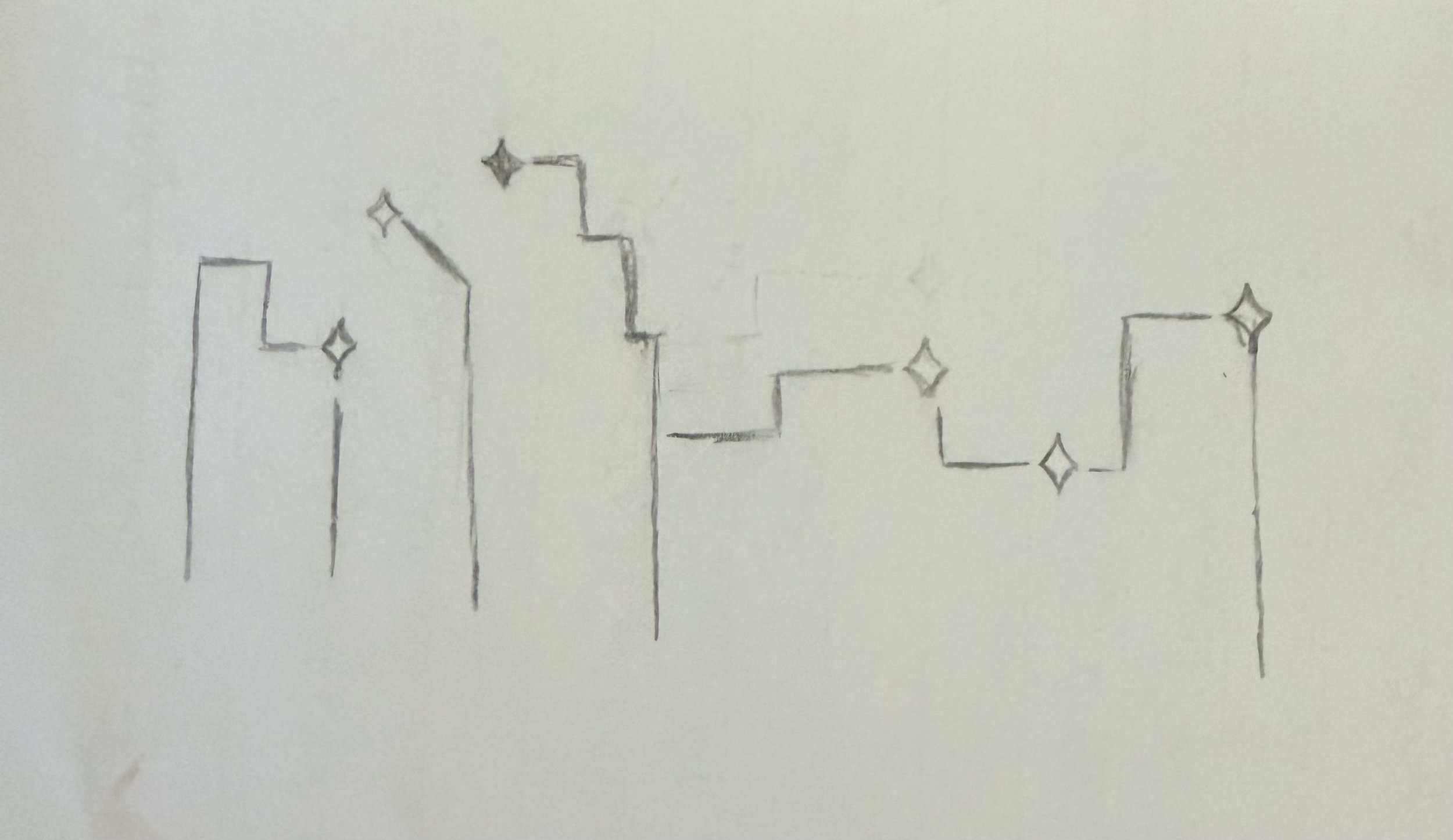
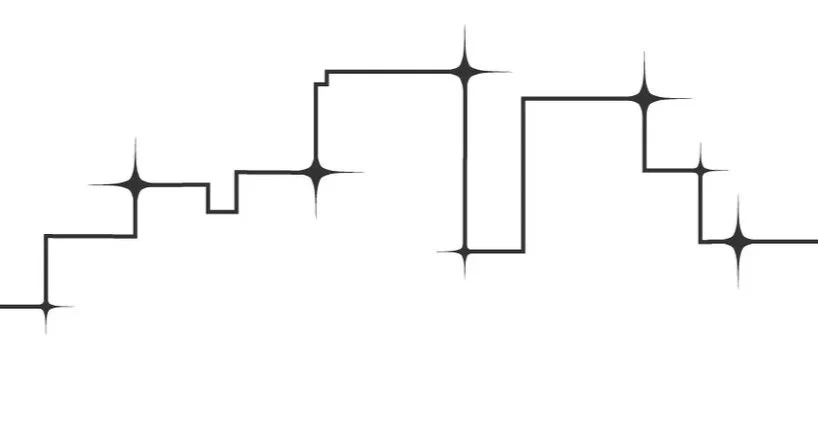
City Beauty’s “City Scape”
A key part of our redesigned unit cartons was the inclusion of a decorative, hand-drawn skyline element, added as an accent on the sides of the box. The sparkles tied in iconography we were already using elsewhere for the brand, while the skyline referenced back to the brand’s name and heritage.

40+
SKUs Redesigned
5
Product Lines Defined
19%
Cost-savings Identified

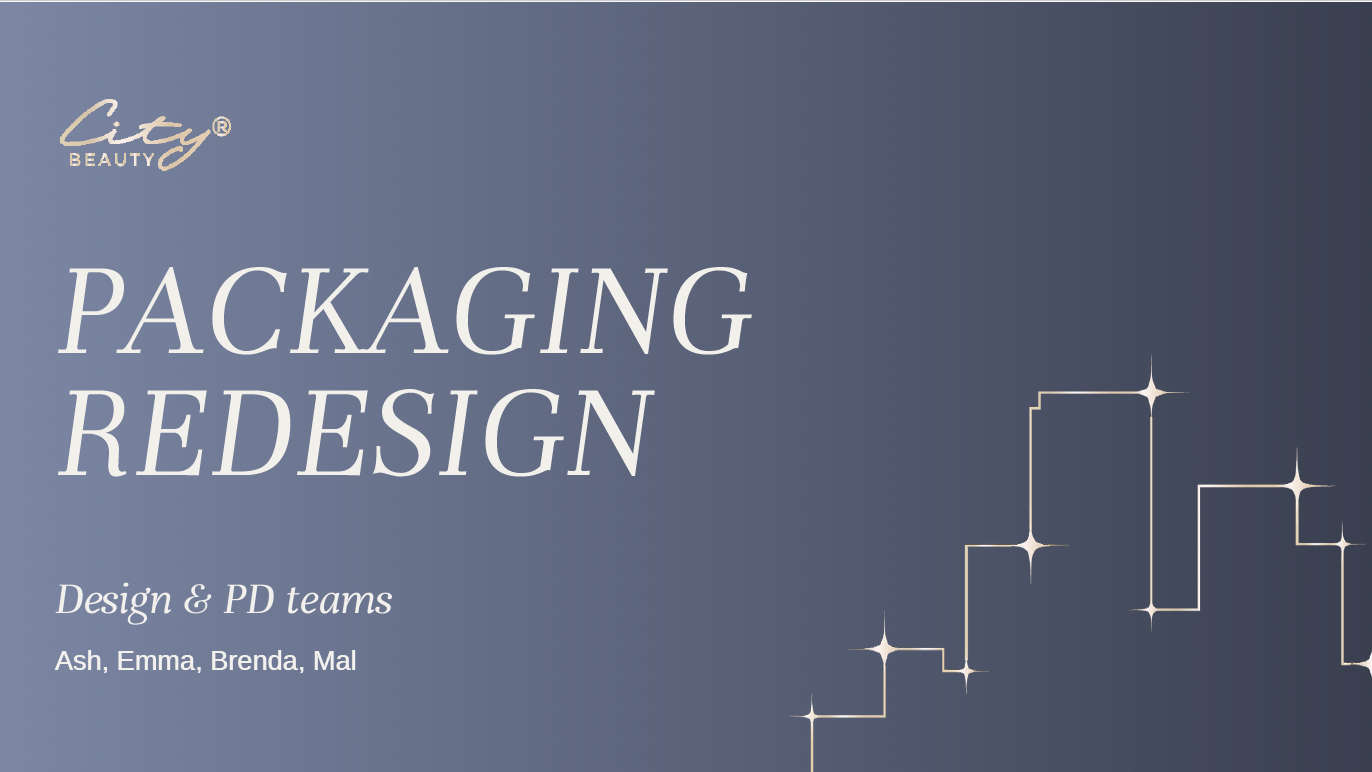
The complete pitch deck includes competitive research, color psychology citations, product line architecture options, UC/SC mockups, and a packaging cost analysis showing 3–19% savings per unit depending on specification changes.