
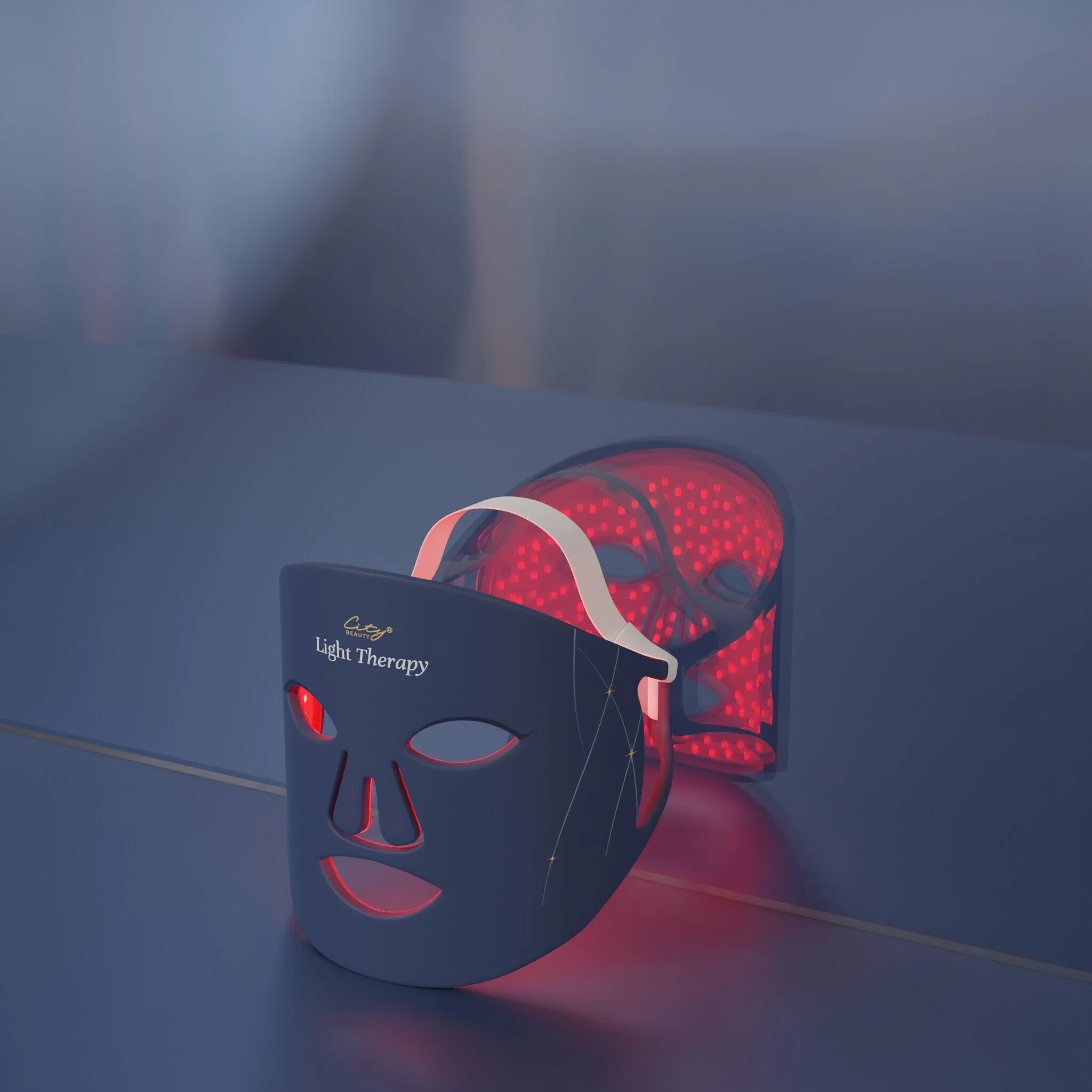
Red Light “Light Therapy” Face Mask
My role: Lead designer - concept through launch-ready production files, managing multiple design iterations through stakeholder review cycles on a four-month timeline.
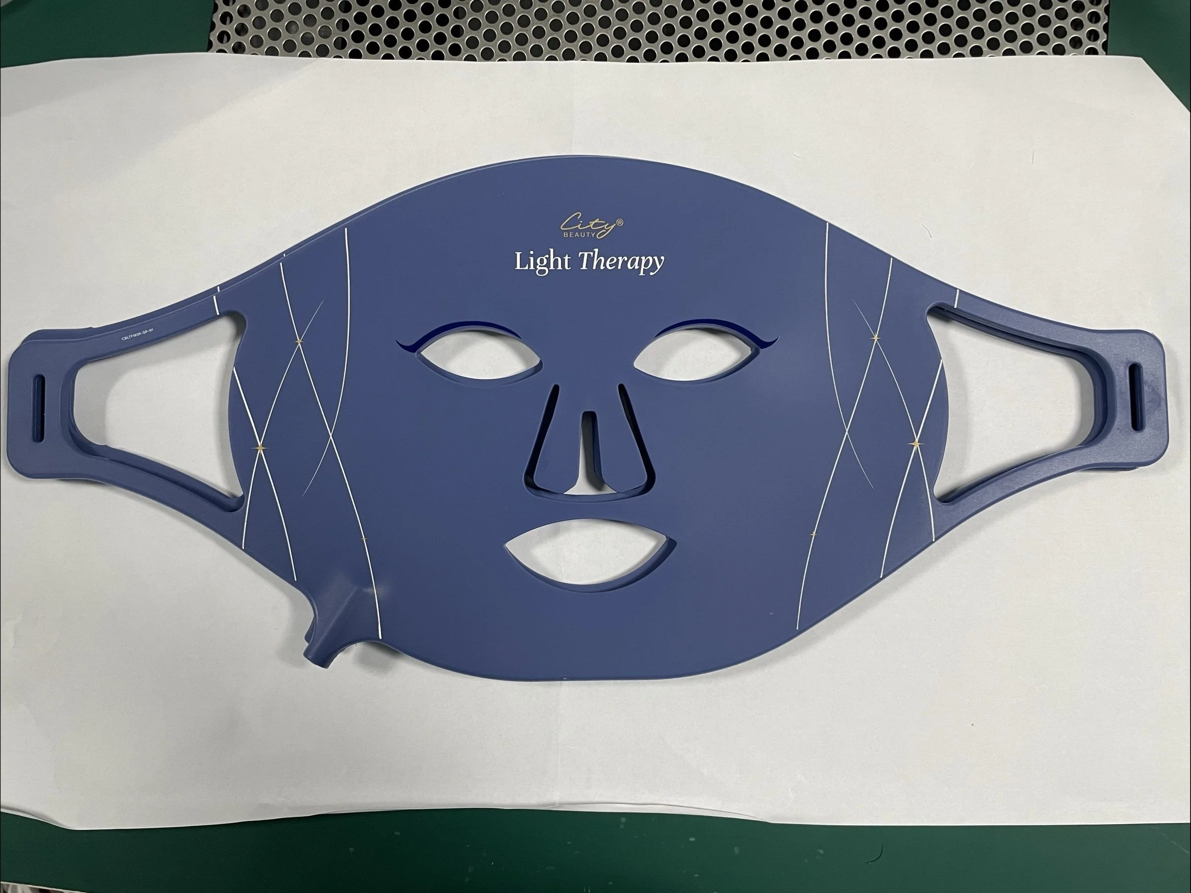
Product Design
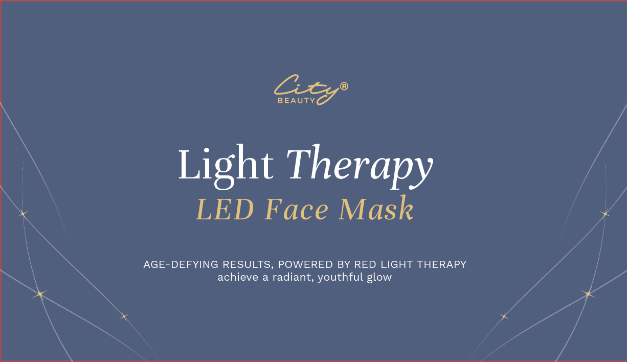
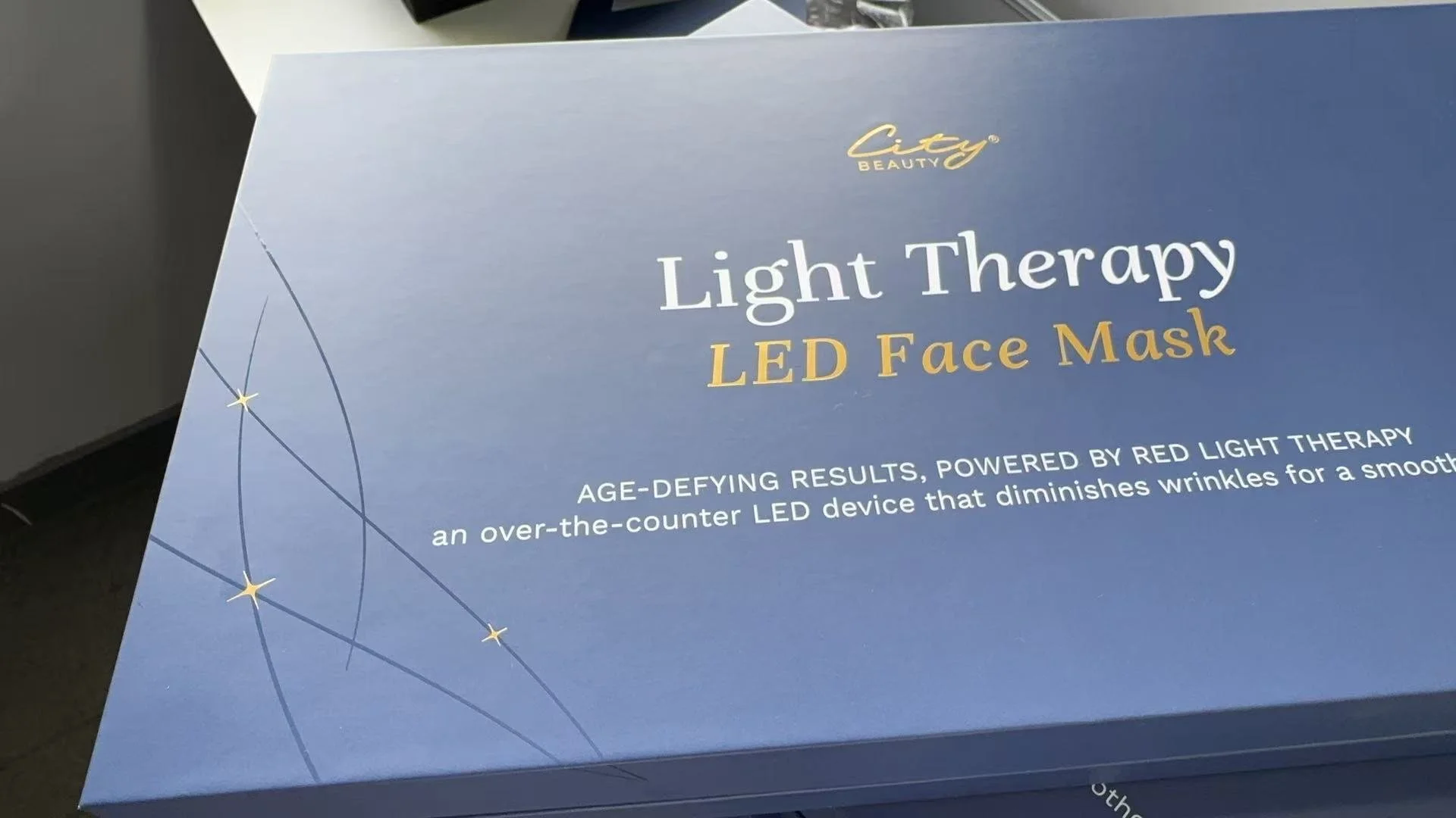
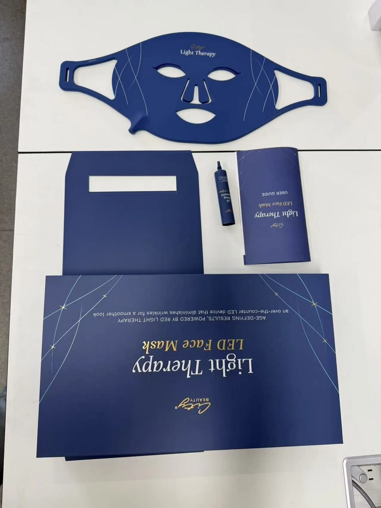
Device packaging
Iteration
Print Production
City Beauty's entry into LED light therapy devices — a white-label red light face mask taken from initial concept to a September launch in four months. The project required designing the device's visual identity from scratch: no existing template, no prior category precedent within the brand. Multiple design directions were explored, reviewed by stakeholders, and refined through successive rounds before landing on the final approved design. Every decision had to balance aesthetic ambition with the realities of a tight timeline and vendor production requirements.
Design Iterations
CONCEPT THROUGH APPROVED FINAL
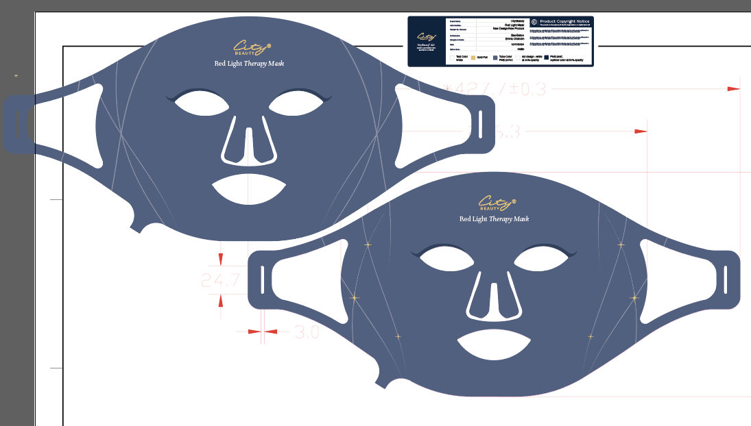
STAKEHOLDER FEEDBACK - ROUND 1
What was working, what wasn’t
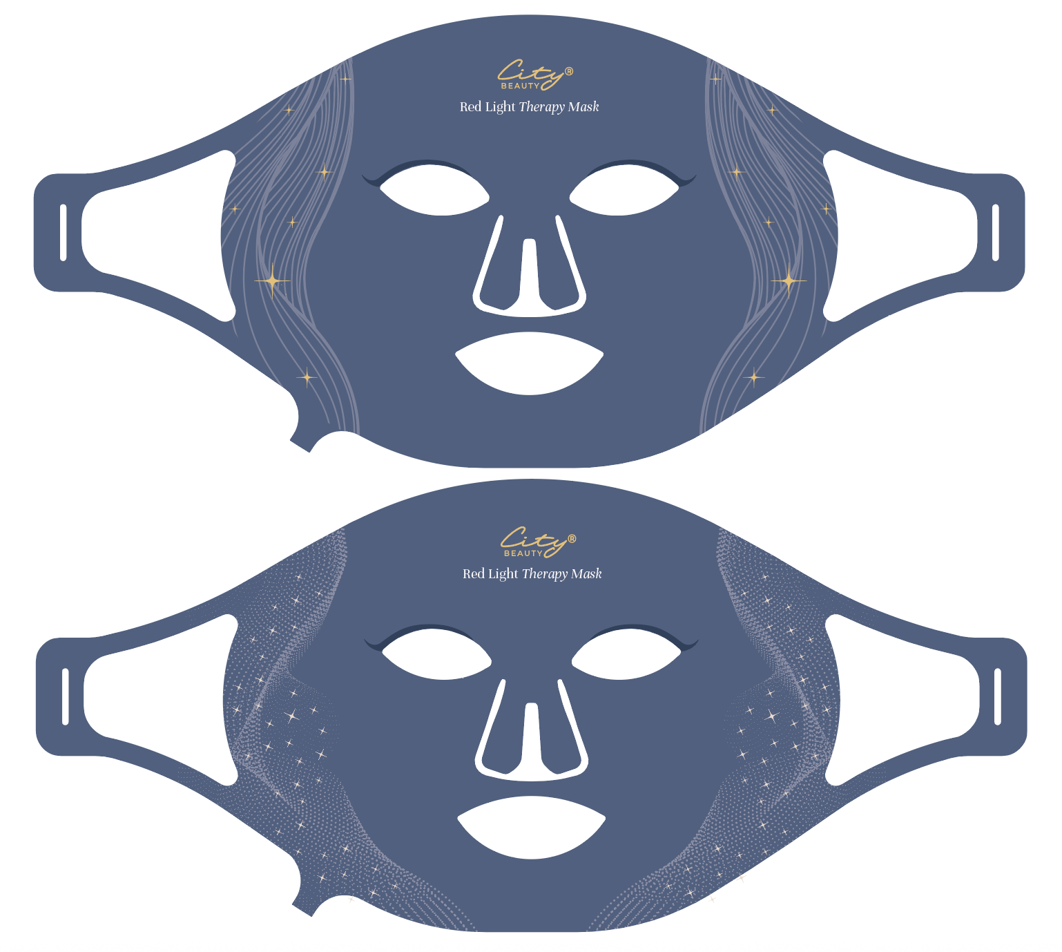
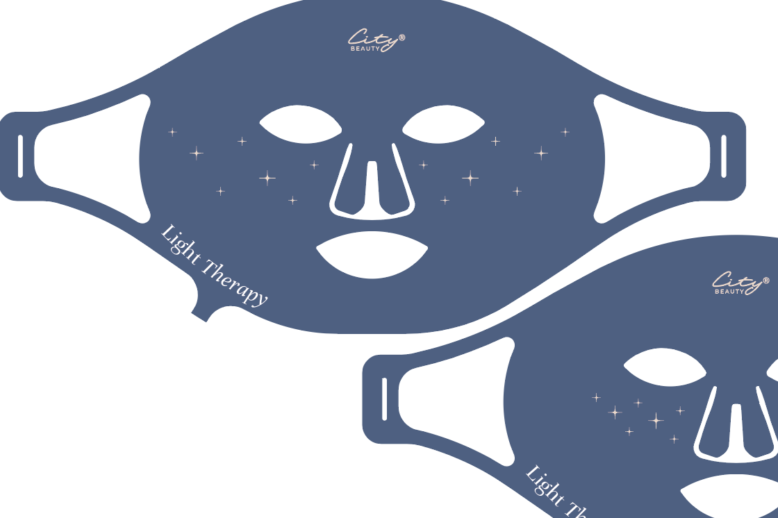
The “stars as freckles” design was too similar to a close competitors’, so we decided to go in a different direction. The line heavy and web-star design, seen in the first image, were both too busy-looking.
DESIGN DIRECTION - ROUND 2
Narrowing ideas down
We ultimately decided to move forward with the design in the 3rd image, lower right corner, for it’s simplicity, elegance, and subtlety.
ADDITIONAL VARIATIONS
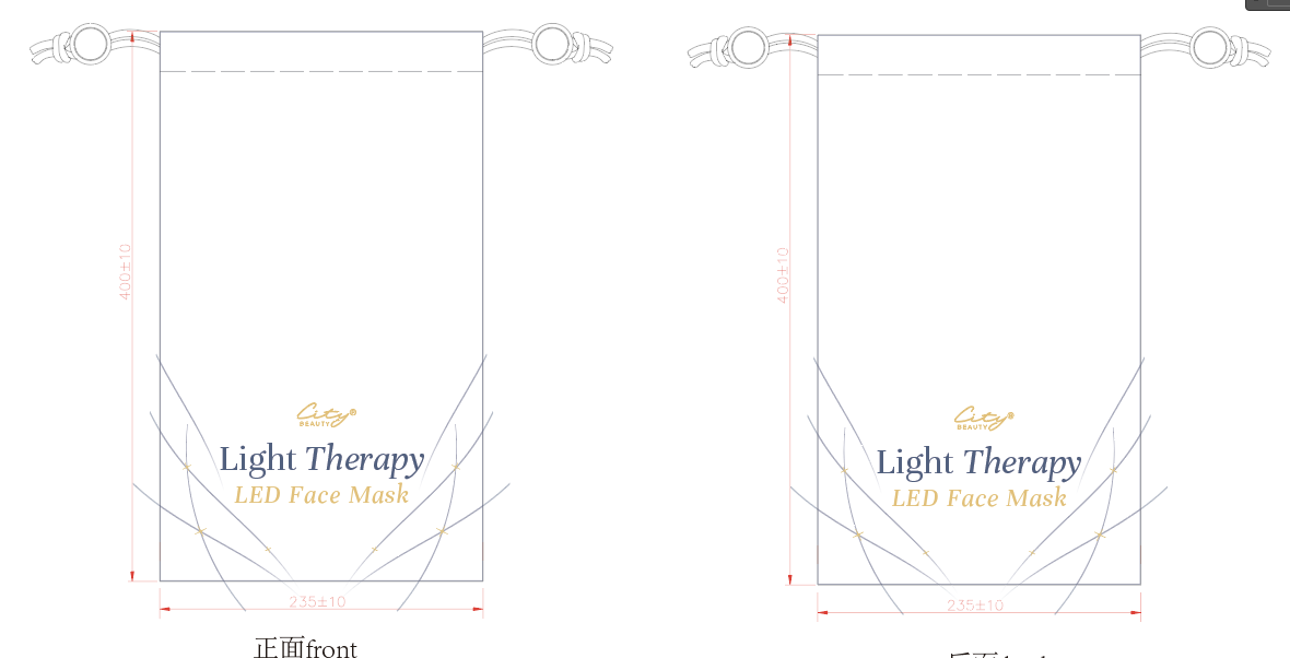
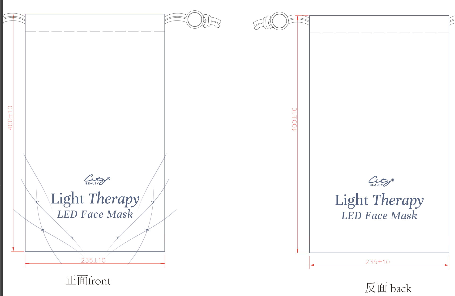
Cloth Dust Bag
We ultimately decided to move forward with the design on the right in the 2nd image, based on the vendor’s machinery and capabilities.
The Challenge
Designing a device is categorically different from packaging a skincare product - the visual identity has to communicate efficacy, technology, and trust while still feeling like City Beauty. The four-month timeline from concept to production meant that iteration cycles had to be tight, feedback turnaround fast, and production specs locked in parallel with creative development rather than after it.
4 mo.
concept to launch
2
production revisions
Sept ‘24
on-time launch